Numbers alone rarely inspire action. A spreadsheet full of data may be accurate, but without clarity, it often fails to communicate meaning. This is where data visualization becomes powerful. When numbers are transformed into clear visuals—charts, graphs, dashboards—they tell stories that are easier to understand, interpret, and act upon.
At cvDragon, we emphasize that data literacy is no longer reserved for data scientists. Whether you’re a student presenting research, a marketer analyzing campaign results, or a manager reviewing performance metrics, the ability to turn numbers into visual stories is a highly valuable skill.
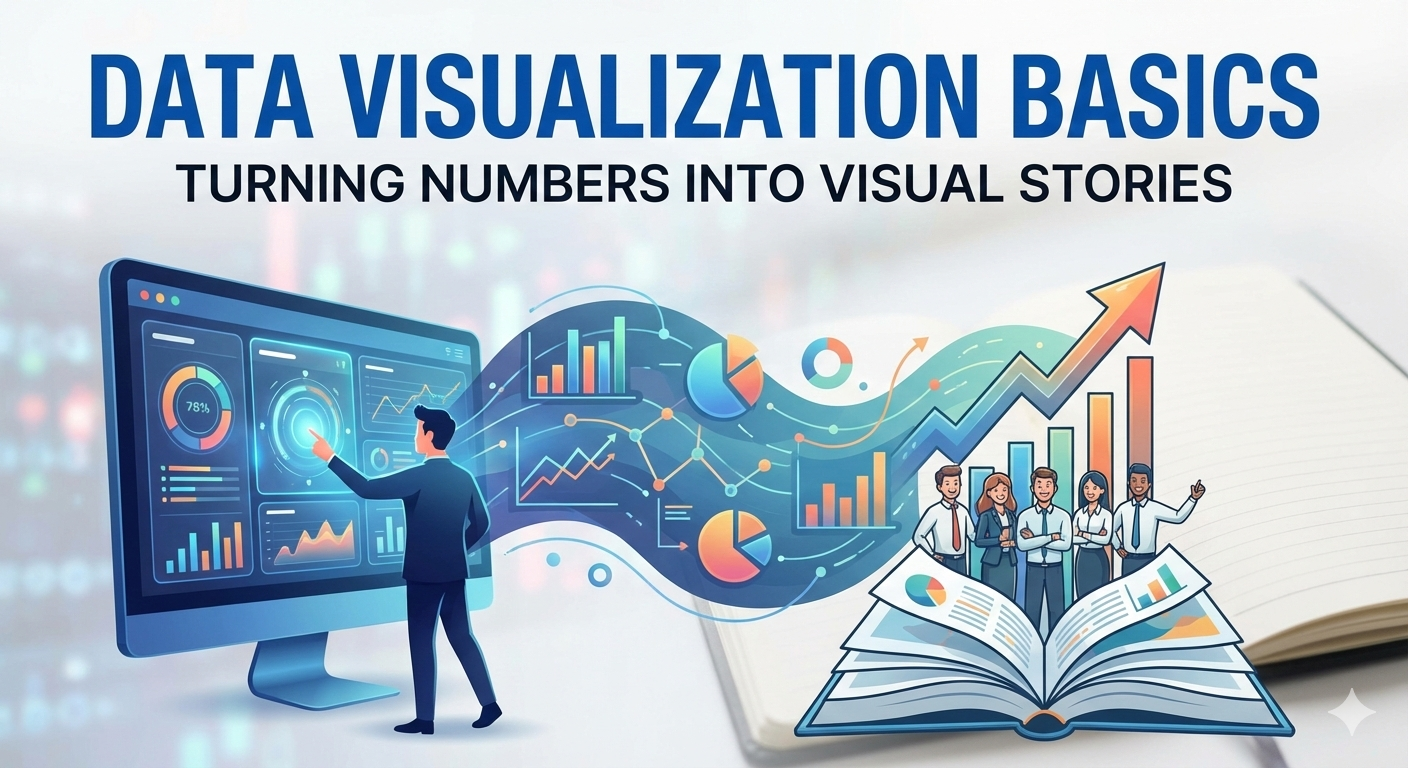
This article explores the basics of data visualization, why it matters, and how you can start creating meaningful, impactful visuals.
What Is Data Visualization?
Data visualization is the process of representing data graphically to make patterns, trends, and insights easier to understand. Instead of reading rows of numbers, audiences can quickly grasp insights through visual formats like:
-
Bar charts
-
Line graphs
-
Pie charts
-
Scatter plots
-
Dashboards
-
Infographics
Effective data visualization simplifies complexity without distorting truth.
Why Data Visualization Matters
We process visuals faster than text. Research consistently shows that people interpret images more quickly than raw numbers. Good visual storytelling:
-
Improves clarity
-
Enhances decision-making
-
Increases audience engagement
-
Supports persuasive communication
At cvDragon, we often guide students to improve presentation skills by incorporating strong visual data representation.
From Data to Story: The Core Idea
Data visualization is not just about charts—it’s about storytelling. A strong data story answers three key questions:
-
What happened?
-
Why did it happen?
-
What should be done next?
Numbers provide evidence. Visuals provide understanding. Together, they create impact.
Types of Common Data Visualizations
Choosing the right chart type is essential.
1. Bar Charts
Best for comparing categories.
Example:
-
Sales across different products
-
Student performance in subjects
Bar charts are simple, clear, and widely used.
2. Line Charts
Best for showing trends over time.
Example:
-
Website traffic growth
-
Monthly revenue changes
Line graphs reveal patterns and direction.
3. Pie Charts
Best for showing proportions.
Example:
-
Market share distribution
-
Budget allocation
However, pie charts should be used sparingly when categories are few and distinct.
4. Scatter Plots
Best for showing relationships between variables.
Example:
-
Study hours vs. exam scores
-
Advertising spend vs. sales
They help identify correlations.
5. Dashboards
Dashboards combine multiple visual elements to provide a real-time overview of key metrics.
They are common in:
-
Business analytics
-
Marketing reports
-
Performance tracking
Principles of Effective Data Visualization
Creating good visuals is both art and science.
1. Clarity Over Complexity
Avoid overcrowded charts. Simplicity improves understanding.
2. Accuracy and Honesty
Never manipulate scales or distort data to exaggerate findings. Ethical visualization builds trust.
3. Choose the Right Chart Type
Different data types require different visuals. Misaligned visuals confuse audiences.
4. Use Consistent Labels and Units
Clear titles, axis labels, and legends prevent misinterpretation.
5. Highlight Key Insights
Use subtle emphasis to guide attention to important points.
Common Mistakes in Data Visualization
Even good data can be misunderstood if poorly presented.
Avoid:
-
Overusing colors
-
Using 3D effects unnecessarily
-
Presenting too much information at once
-
Ignoring context or explanation
Remember: The goal is understanding, not decoration.
Tools for Data Visualization
You don’t need advanced programming skills to start.
Popular tools include:
-
Microsoft Excel
-
Google Sheets
-
Tableau
-
Power BI
-
Canva (for infographics)
-
Python or R (for advanced users)
Students can begin with spreadsheet tools before moving to specialized software.
Data Visualization for Students
Students benefit from visualization in many ways:
-
Presenting research projects
-
Analyzing survey results
-
Creating academic reports
-
Preparing case study presentations
Visual storytelling strengthens communication skills and confidence.
At cvDragon, we encourage students to showcase data visualization skills in portfolios and resumes.
Data Visualization in Professional Settings
In workplaces, visuals drive decisions.
Managers rely on dashboards to:
-
Monitor performance
-
Track progress
-
Identify problems early
Marketers use visuals to:
-
Analyze campaign results
-
Measure engagement metrics
Financial analysts visualize trends to:
-
Forecast growth
-
Assess risks
The ability to communicate data visually enhances credibility and influence.
The Role of Critical Thinking in Data Visualization
Visualization is not just technical—it requires analysis.
Ask:
-
What story does the data truly tell?
-
What insights matter most to the audience?
-
What context is necessary?
Critical thinking ensures visuals are meaningful, not misleading.
Visual Storytelling and Persuasion
Well-designed data visuals can persuade audiences effectively.
For example:
-
A clear upward trend can demonstrate growth.
-
A comparison chart can justify budget decisions.
When combined with narrative explanation, visuals become compelling communication tools.
Ethical Data Visualization
Ethics in data visualization means:
-
Avoiding selective data presentation
-
Providing context
-
Being transparent about limitations
Misleading visuals damage trust and professional reputation.
At cvDragon, we stress the importance of integrity in all professional communication.
How Data Visualization Builds Career Skills
Mastering data visualization develops:
-
Analytical thinking
-
Presentation skills
-
Attention to detail
-
Digital literacy
These skills are valuable across industries, including marketing, finance, research, technology, and management.
Practical Steps to Improve Data Visualization Skills
-
Practice with real datasets.
-
Analyze existing dashboards critically.
-
Learn basic design principles.
-
Focus on clarity and storytelling.
-
Seek feedback on your presentations.
Consistent practice transforms raw numbers into meaningful narratives.
cvDragon’s Perspective on Data Literacy
At cvDragon, we believe data visualization is a key component of modern career readiness. We guide students and professionals to:
-
Build analytical confidence
-
Present insights clearly
-
Combine data skills with communication skills
Data literacy empowers individuals to contribute more effectively in academic and professional settings.
Conclusion
Data alone informs—but visual stories inspire understanding and action. In an era driven by analytics and evidence-based decisions, mastering data visualization basics is not optional—it’s essential.
At cvDragon, we believe that the ability to transform numbers into clear, compelling visuals sets individuals apart. Whether you are a student, analyst, or future leader, strong data visualization skills will help you communicate insights with clarity, confidence, and impact.
Numbers speak—but visuals make them heard.
Leave a Reply