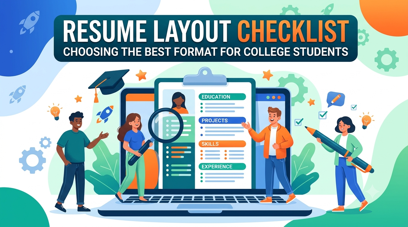
When you’re in college, building a resume can feel a bit like a chicken-and-egg problem: How do you get experience if you need experience to fill out your resume?
The secret isn’t embellishing your history—it is choosing the right resume layout. The way you structure your page tells hiring managers what to focus on before they read a single sentence. If you format it correctly, you can highlight your potential, your education, and your drive, even if your professional work history is light.
Here is your ultimate resume layout checklist to help you choose and build the perfect format for your college applications or early-career job hunts.
1. Pick Your Strategic Format Archetype
Different majors and career paths require different visual strategies. Your first step is deciding which layout structure fits your specific background.
Option A: The Reverse-Chronological Layout (The Safe Bet)
-
Best for: Students with solid internship experience, steady part-time jobs, or extensive leadership roles in campus clubs.
-
How it works: It lists your most recent experiences first and moves backward in time. It is highly favored by recruiters because it is incredibly easy to scan.
-
Why it works: It proves you have already operated in a professional environment.
Option B: The Functional / Skills-Based Layout (The Pivot)
-
Best for: Students changing fields, those with major gaps, or those whose work experience is completely unrelated to the job they want.
-
How it works: It groups your history by skill categories (e.g., “Data Analysis,” “Content Creation”) rather than specific job titles.
-
Why it works: It shifts the recruiter’s eye toward what you can do rather than where you have worked.
Option C: The Hybrid / Combination Layout (The Student Sweet Spot)
-
Best for: The vast majority of college students.
-
How it works: It leads with a powerful skills summary or key academic projects, followed by a standard, brief chronological work history.
-
Why it works: It balances your potential (academic projects and technical skills) with your real-world work ethic (part-time retail jobs or volunteer work).
2. The College Student Layout Checklist
Once you’ve chosen your format, use this checklist to ensure your layout is clean, modern, and optimized for both human eyes and Applicant Tracking Systems (ATS)—the software companies use to screen resumes.
▢ Contact Information (The Header)
-
[ ] Name is prominent (14–16pt bold).
-
[ ] Clean, professional email address (e.g.,
firstname.lastname@gmail.com). -
[ ] Live link to your LinkedIn profile (ensure it is updated!).
-
[ ] Location (City, State is fine—no need for a full street address).
-
[ ] Optional: Link to a portfolio or GitHub if you are in design or tech.
▢ The Pivot: Education Placement
-
[ ] Rule of Thumb: If your GPA is strong (above 3.5), or if your university name carries heavy weight in your industry, put Education at the top of your resume. If you have two major internships under your belt, move Education below your experience.
-
[ ] Expected graduation date is clearly stated (e.g., “Expected May 2027”).
-
[ ] Relevant coursework listed (stick to 4–6 advanced classes that match the job description; skip intro-level classes).
▢ The “Experience” Section (Broaden the Definition)
-
[ ] Did you include more than just paid corporate jobs? As a student, “Experience” can legally include:
-
Significant group capstone projects
-
Volunteer work or community organizing
-
Holding an executive role in a fraternity, sorority, or student club
-
Independent freelancing or personal coding projects
-
-
[ ] Every entry has 2–4 bullet points starting with strong action verbs (e.g., Managed, Optimized, Built).
▢ Typography and White Space (Readability)
-
[ ] Stick to one page. Unless you are applying for a PhD program, a college student’s resume should never be two pages.
-
[ ] Margins are set between 0.5 inches and 1.0 inch all around.
-
[ ] Font sizes are consistent: 10–12pt for body text, 12–14pt for section headers.
-
[ ] Standard, highly readable fonts are used (e.g., Arial, Calibri, Helvetica, or Georgia). Avoid overly stylized, decorative fonts.
Quick Reference: Layout Comparison
| Layout Element | Chronological Format | Hybrid Format |
| Top Section | Professional Summary & Education | Skills Summary & Key Projects |
| Core Focus | Career progression and timeline | Core competencies and versatile skills |
| Best Used For | Traditional industries (Finance, Corporate) | Modern/Creative industries (Tech, Marketing) |
💡 CVDragon Pro Tip: Never save or send your resume as a Word document unless explicitly asked. Formatting shifts wildly between different operating systems and Microsoft Word versions. Always export and submit your final draft as a PDF to lock your layout exactly as you designed it.
At CVDragon, we build smart tools to take the guesswork out of formatting. Choose from our field-tested templates designed specifically to help students look polished, professional, and ready for day one.
Leave a Reply